GD154 Week 2
The Anatomy of Type
January 16, 2018
GD154 Typography
- Understanding the Lingo: Anatomy and terminology of type.
- Working with letterforms and testing words.
- Basics of critique.
- Critique: Project 1 Type as Form.
- Assigned: Project 2 Type Classification Presentation.
Homework
- Project 1: Continued work on geometric typeface. Develop the entire alphabet.
- Project 2: Exchange contact information. Assign tasks and begin working on the project.
Sigurður Ármannsson
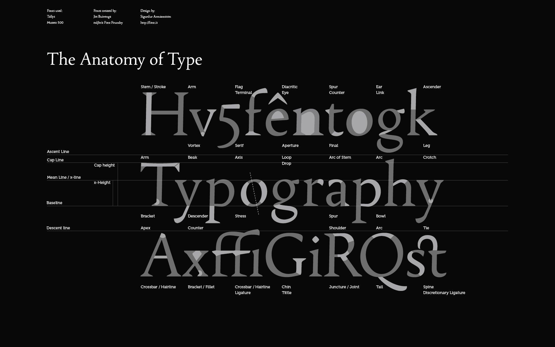
Back in 2009, Sigurður Ármannsson was looking for a comprehensive overview of the anatomy of type. Finding few good resources, he created one.
For some time I have tried to get a reliable information about the individual parts of the characters of the alphabet. The anatomy of type if you like. It was not so easy to find online. Still I found some and then some in various books.
The problem however is I did not find any one source I was fully satisfied with. Each one had some names missing which the others had and so on..
I collected all this info together and put in one as complete as I could. A second problem was to find a typeface that included everything. I finally gave up. It’s really hard to squeeze everything in. The ones that seemed to fit the best like Times for instance I didn’t want to use and some I wanted to use didn’t have all the major part names.
I finally decided to use a two beautiful and also free fonts, Tallys and Museo by Jos Buivenga. Some of the definitions I put in are maybe on the borderline, but not seriously I think. Take for instance a look at the crossbar in the ffi-ligature. The name there is Crossbar or Hairline. In this font it’s not quite a hairline but closer to a crossbar. Also the terminal drop on the r. I am taking a little chance there — the definition probably has more of a drop form in mind.
Designer, author, educator Timothy Samara is a world authority on type and graphic design. His 2004 Rockport book, Typography Workbook has become an essential reference text for design classrooms and industry professionals. Now, in Letter Forms: The Design of Type, Past to Future he takes readers even deeper, expertly guiding them through the aesthetics as well as the technical considerations of his subject.
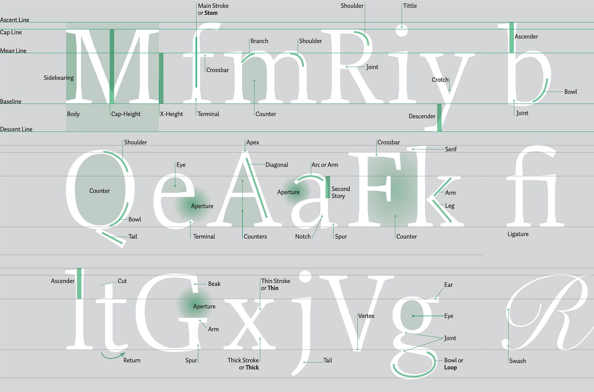
In his book, Design Elements: A Graphic Style Manual, Timothy Samara published one of the more comprehensive diagrams of typographic anatomy.
FontShop
FontShop was started by Joan Spiekermann, Erik Spiekermann and Neville Brody on June 12, 1991. Since then, FontShop has been a defining organization for the development of typography and type design, introducing iconic type families to the world, and educating a generation of designers about typography.
FontShop was acquired by Monotype on July 14, 2014.
Erik Spiekermann
Erik Spiekermann is one of the best-known typographers and graphic designers in the world. Not only does he represent German typeface and corporate design like no other, but his work and the companies he founded — MetaDesign, FontShop, and EdenSpiekermann — have also had an unparalleled influence on contemporary graphic design around the globe.
FontShop Education
Some of the resources that FontShop have created have been upgraded over the years, so some of the old resources are no longer available from FontShop, but have been archived by others.
Without training the best typefaces can only go so far. That’s why FontShop is more than a shop that sells fonts — we want to help you do great work too. Get more typography tips and tutorials at fontshop.com/education.
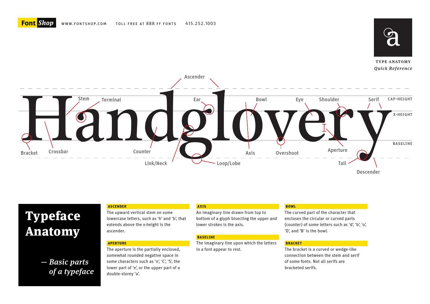
Type Anatomy Quick Reference
For example, the Type Anatomy Quick Reference that we have used as a handout in class is available as a PDF file via a quick Google search.
A Field Guide to Typography
The top search results for the FontShop reference, Meet Your Type: A Field Guide to Typography does not bring you to the FontShop, but various blogs that have archived these old resources. Download the PDF.
Hopefully, Erik won’t consider this to be stealing sheep, but rather feeding and caring of abandoned sheep.

FontBook
Periodically, FontShop would release a new version of their printed compendium of the fonts that they offered through their shop. These volumes were highly anticipated and coveted by designers around the world. With the advent of the iPad, FontBook was also released as an iPad app.
FontBook is no longer in print. It is now available only as an iPhone/iPad app. Used copies of the print edition can usually be found at Amazon and AbeBooks.
Resources
Thinking with Type
by Ellen Lupton